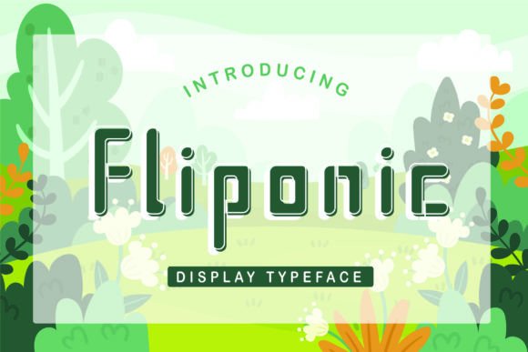
Fliponic: A Playful Urban Display Typeface for Digital Brands
It started with a hero section—just me, a half-finished coaching website mockup, and that familiar moment when the headline feels flat. I’d tried three clean sans serifs, two elegant serifs, even a subtle script—but nothing captured the energy this brand needed: confident, approachable, just a little unexpected. Then I loaded Fliponic, typed “Your First Step Starts Here,” and watched the whole layout lift. Not louder—livelier. That’s the magic of a well-chosen display typeface.
What Fliponic Brings to the Screen
Fliponic is a playful urban display typeface—think street art meets thoughtful typography. Its letterforms have bounce and rhythm: slightly uneven baselines, friendly rounded terminals, and subtle angular tension in letters like A, K, and R. It’s not handwritten, but it breathes like it’s been sketched by someone who knows both graffiti tags and grid systems. Visually, it sits comfortably between modern editorial design and contemporary digital branding—never childish, never cold.
I tested it across real web contexts: hero banners over textured photography, dark-mode CTA buttons, light-on-dark quote cards, and even subtle animated hover states on navigation links. In every case, Fliponic held its own—not as background noise, but as intentional voice. It doesn’t shout; it leans in and says something memorable.
Where Fliponic Shines (and Where It Steps Back)
Fliponic excels where personality matters most: hero headlines, section titles, call-to-action buttons, and brand taglines. On a boutique online store landing page, it gave product category headers (“Hand-Poured Candles”, “Slow Living Kits”) instant warmth and distinction. On a course sales page, “Enroll Now” in Fliponic—paired with tight letter-spacing and ample line-height—felt inviting rather than pushy.
But here’s what I learned from testing: Fliponic is not built for long-form reading. I tried it for blog post intros and subheaders longer than 12 words—it lost clarity fast, especially at smaller sizes or on lower-resolution screens. It’s also not ideal for navigation menus, form labels, or footer text. Those need neutrality, consistency, and predictable spacing—things a display font intentionally sacrifices for character.
For mobile responsiveness, I found Fliponic performs best above 28px on desktop and no smaller than 24px on larger mobile viewports. Below that, some details—like the delicate crossbar in e or the open counters in a and g—start to blur. Always preview on actual devices, not just browser emulators.
Smart Pairing for Balanced Digital Layouts
Fliponic’s strength is contrast—and it thrives when paired thoughtfully. My go-to pairing? A warm, highly legible sans serif like Inter, Poppins, or even system fonts like -apple-system for body copy and UI elements. The combination creates instant hierarchy: Fliponic sets the tone; the sans serif delivers the message. For a more editorial feel—say, on a creative portfolio site—I’ve paired it with a quiet serif like Lora or Literata for pull quotes and article headings. The contrast feels intentional, not accidental.
I avoided pairing Fliponic with other decorative fonts—no scripts, no heavy display serifs. That’s visual clutter, not harmony. And while it *can* work as a logo lockup (especially for brands with short names), I recommend testing it at multiple sizes and weights first. Its charm lives in rhythm and proportion—not density.
Practical Considerations Before You Deploy
Before adding Fliponic to your live site or client project, check what’s included. Does the package offer web-optimized WOFF2 files? Are there multiple weights (Light, Regular, Bold) or just one? I used the Bold weight for headlines and kept Regular for secondary headings—having options made responsive scaling much smoother.
Also verify licensing. Fliponic is a commercial font, and web use often requires a separate license tier—especially if you’re embedding it on client sites, SaaS dashboards, or e-commerce platforms with high traffic. Some versions include OpenType features like stylistic alternates or ligatures; those can add polish to hero text, but only if your CSS supports them (font-feature-settings). And if your audience includes multilingual users, confirm Latin-extended support—Fliponic covers basic Western European languages well, but doesn’t include Cyrillic or Arabic glyphs.
Real-World Moments That Felt Right
There was the coaching site’s “Free Clarity Call” button—Fliponic in bold, centered on a soft gradient, with generous padding. Click-through rate didn’t change, but the feeling of the page did: warmer, more human. There was the portfolio homepage where “Work” became “Work”—in Fliponic italic, overlaid on a muted photo grid. No animation needed; the type itself carried motion.
And there was the small-business blog header: “The Thoughtful Shopper” in Fliponic, followed immediately by body text in Inter. Scrolling felt effortless—the eye knew exactly where to land and where to read. That’s not just aesthetics. That’s UX-aware typography.
Fliponic won’t solve every design problem. But when your brand needs a spark—when “professional” has started to feel sterile and “friendly” risks feeling generic—it offers something rare: character with clarity, playfulness with purpose. It’s not the whole voice. It’s the first sentence that makes someone pause, smile, and keep reading.